Changelog
-
As iOS 26 is now publicly available, I updated the article to remove references to the beta. I also added some more text to the Get out of the way section, explaining my stance on this topic.
-
Added an update about iOS 26.1 and its improvements to Liquid Glass: Update: iOS 26.1
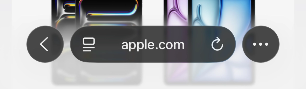
iOS 26 and its Safari introduced exciting new features for web designers. Most importantly a completely new design language for the frame around on top of the websites we build. I’ve been using it for a few months now and collected some advice for designing and developing websites for the delightful and elegant new design language, Liquid Glass™.
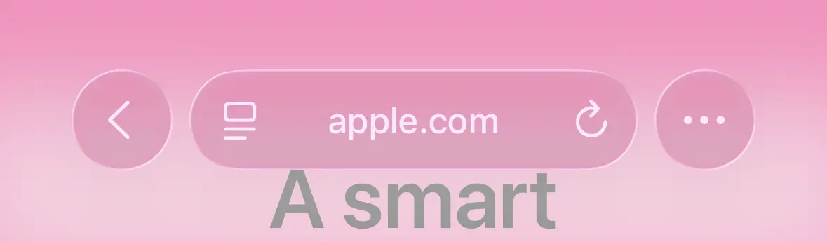
Avoid mid-tone colours
Avoid mid-tone colours because Liquid Glass™ can only deal with extremes. If you want text in the UI to be readable ❶ , stick to colours that are either dark or very close to white:
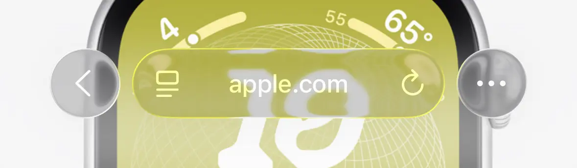
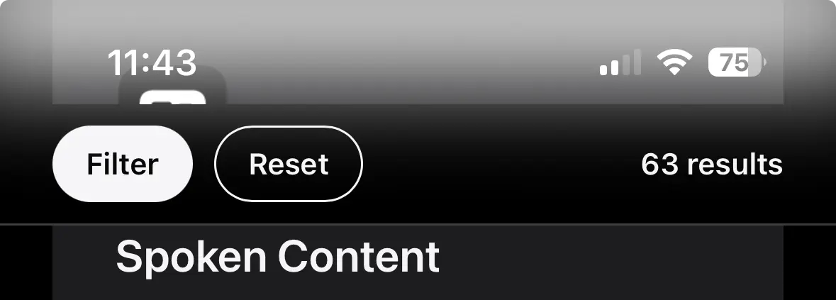
Avoid images with too many colours
The same principle applies to using images. They should not have too many different colours to not confuse Liquid Glass™. Depending on where you live or work, using too many colours might be prohibited anyways, so better just avoid them altogether:
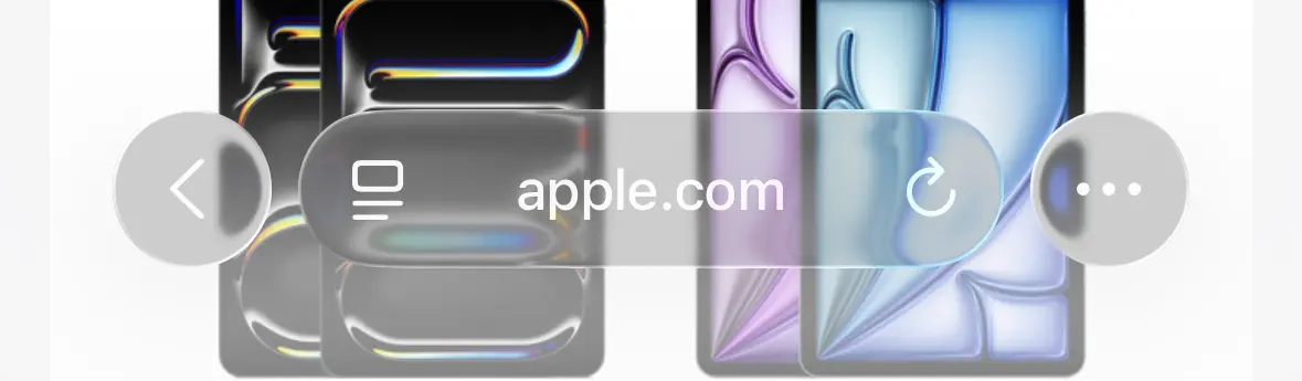
Avoid non full-width elements
Using elements or images that are not spanning the full-width confuses Liquid Glass™, because it’s leading to half dark, half light parts of the screen. Liquid Glass™ will then calculate an average colour that lacks contrast on both sides:
Avoid switching colours
Stick to a single colour throughout your design. Switching between different colours too often will be jarring as every time users scroll over them, the browser UI has to adjust:
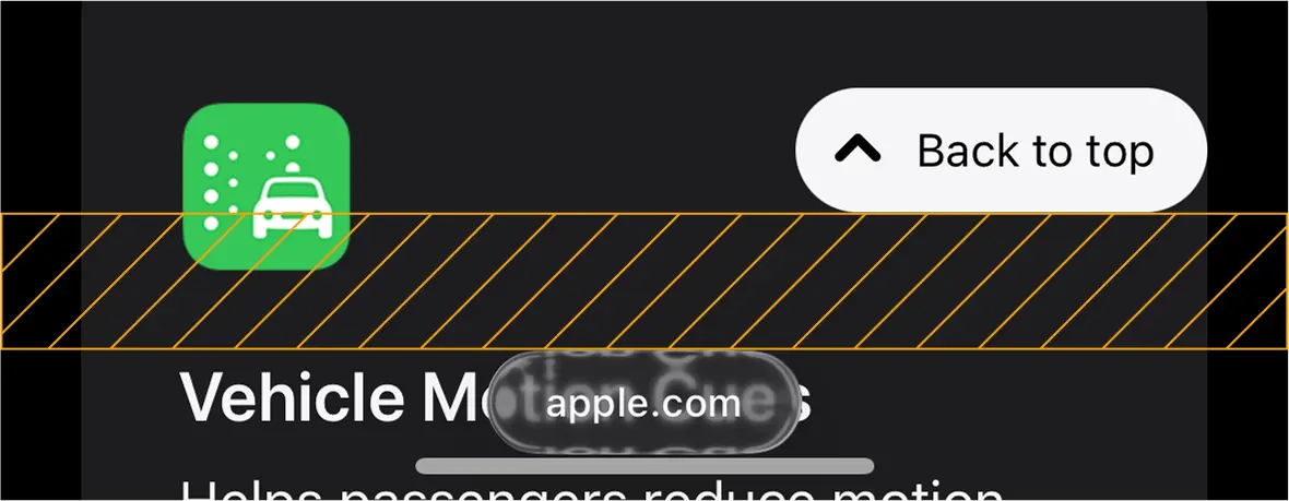
Alternative text description of the video
A screen recording of iOS 26 Safari showing apple.com. The user scrolls down the page, which has sections with different colours. The browser UI switches between light and dark mode multiple times.At some point you’ll even get what looks like a “penalty background colour”. This means you used too many colours and your users will now have to live with less vertical space. Great job:
Avoid the top
Avoid putting elements on the top part of your site, or you’ll end up with automatic gradients that might not fit your design and offer poor contrast in the status bar:
Avoid the bottom
Avoid fixing elements to the bottom of the viewport. There’s significant reserved space around the glass UI, which will cause your element to be positioned further up than you might think, leading to unwanted whitespace in the most reachable area:
I stubbornly wanted to only use screenshots of apple.com, but I think you can imagine how much worse this looks with full-width elements on the bottom of the page creating a big gap.
Get out of the way
Browsers are supposed to be a window to the web, getting out of the way and making sure websites are displayed correctly without needing adjustments for each individual one. Now we have Apple saying their new design “gets out of our way” while doing the exact opposite.
Sarcasm can be hard to convey in writing but I hope you get the point of this article. Personally, I will not try to fix Apple’s bad design decisions in the websites I build. I will not follow any of the “advice” I just gave. Apple themselves are not following it either.
I actually think the talented folks at Apple did their job as well as they could given the constraints of Liquid Glass™. So much thought went into it. It’s just a terrible idea for a design language in the first place.
If you’re looking for a less sarcastic take on this topic, I recommend reading Rose-Gold-Tinted Liquid Glasses by Louie Mantia.
Update: iOS 26.1
Some time has passed, and Apple recently released iOS 26.1 with some improvements to their new design. They even added a toggle to “(…) choose your preferred look for Liquid Glass”:
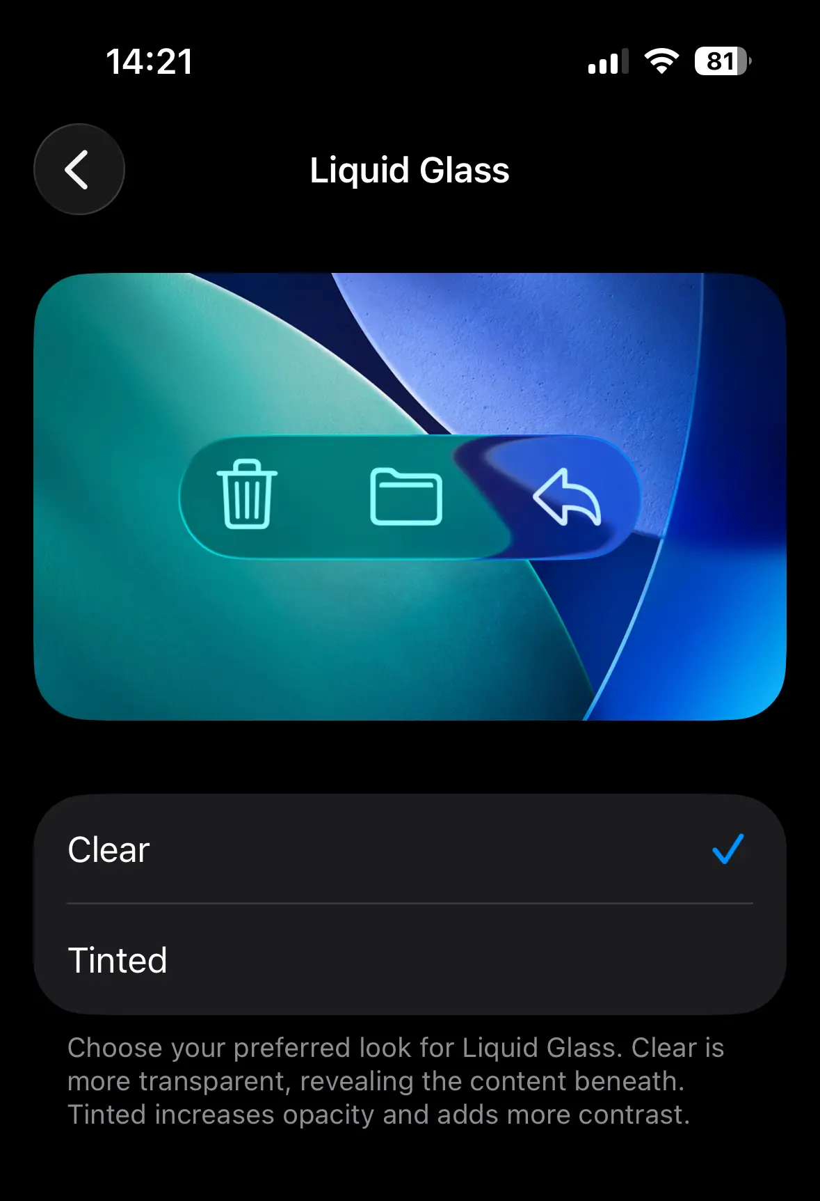
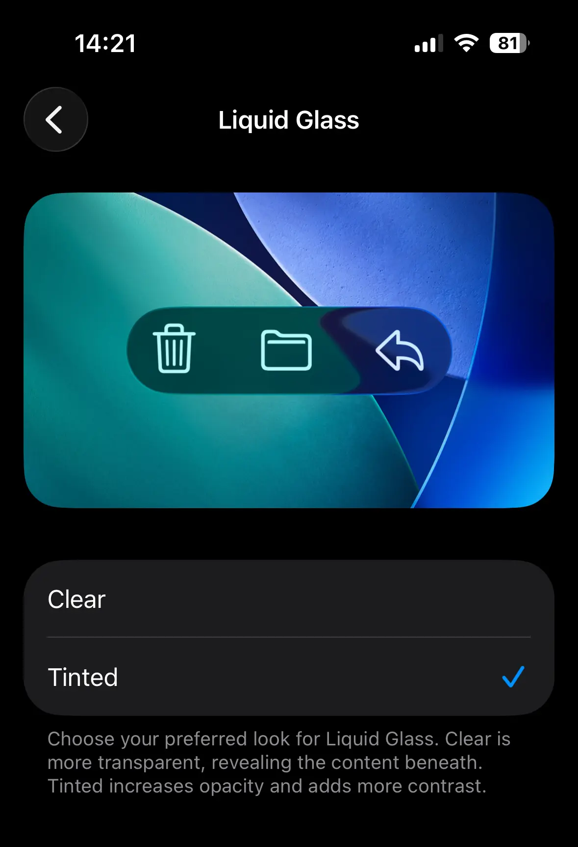
The preview images give a good idea of what to expect but they are actually understating the improvements. I mean, just look at one of the worst offenders from before and how much better it looks with the new “Tinted” option enabled:
Some fundamental issues remain, like the generous reserved space around the glass UI, the automatic gradients, the penalty background colour, or the constant switching between light and dark mode. But it’s definitely a step in the right direction.
-
WCAG: Text should have a contrast ratio of at least 4.5:1 for regular text, 3:1 for large text.
Understanding SC 1.4.3: Contrast (Minimum) (Level AA) ↩
Replies
- 3 replies
- 44 boosts
- 52 favourites
-

@Thomas Günther ”It’s just a terrible idea for a design language in the first place.“ 💯
I‘m already in the mood of hating the new design before I even used it for a single moment … 🤷♂️
-

@Thomas Günther I'll make sure to do the exact opposite in the hopes enough people are pissed off so they paddle back on it in iOS and macOS 27, thx for the reference
-

@Thomas Günther I'd really like to go back to the aesthetics of System 9. Or at least OSX 10.7.