As someone who switched from web design to development, I still have that urge to toggle the layout grids on and off. You know, pressing Ctrl + G every few seconds. While browser dev tools have grid overlays, they’re kind of buried in menus. So I built my own!
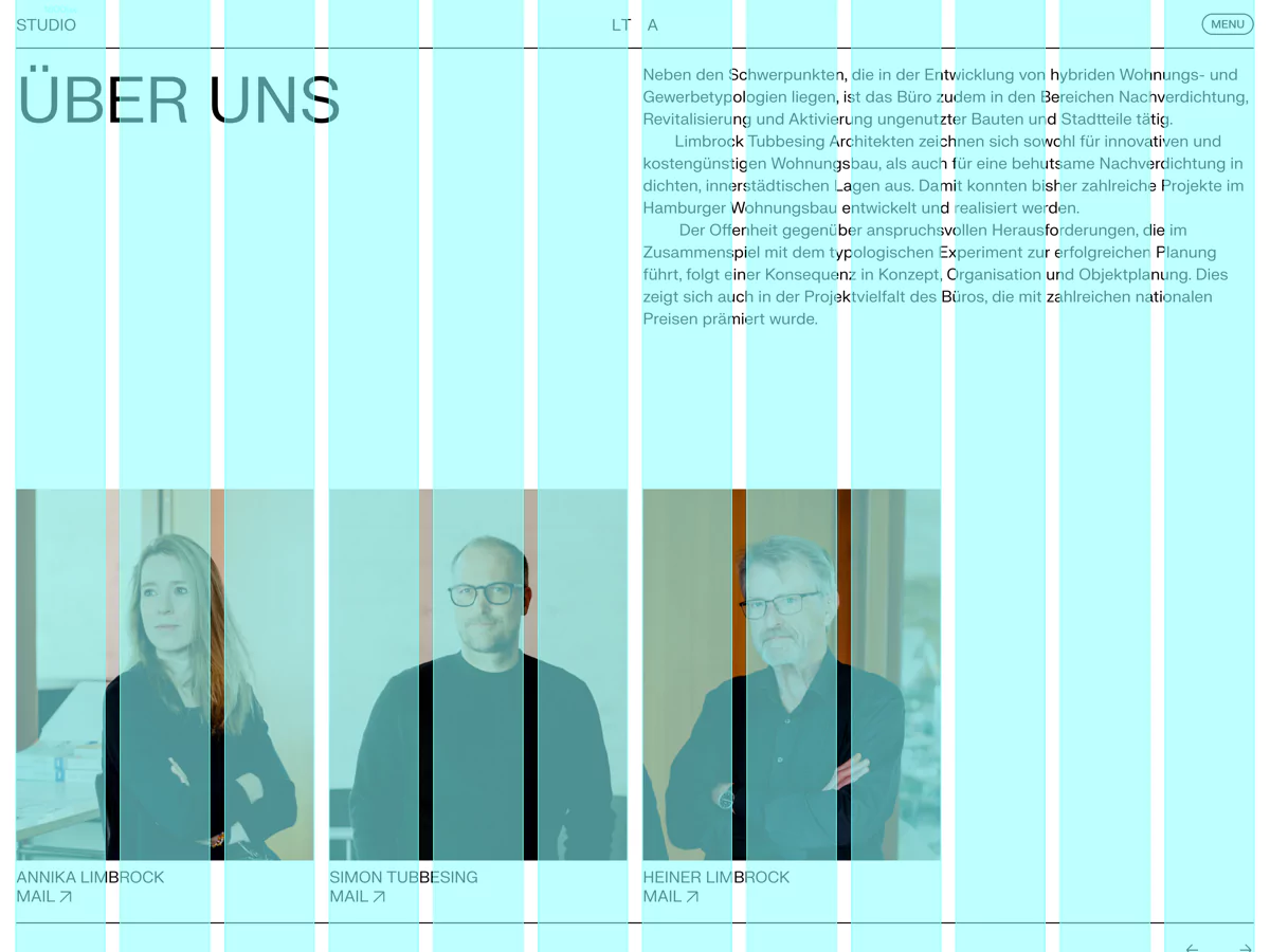
This article’s grid is very simple of course, especially on smaller screens. So here are two screenshots of real-world websites:
On some websites I even use multiple grid layouts, because different sections have different grids. On this website you can press Ctrl + G multiple times to cycle through them.
How it works
The magic happens by creating an overlay that uses the exact same grid system as the rest of your website. This means when you toggle the guides, you’re seeing your actual layout grid.
The JavaScript
I wrote a JavaScript class that creates the guides and listens for keyboard shortcuts to toggle them on and off. It also handles the number of columns based on media queries and updates a data attribute with the current window width.
export default class Guides {
  /**
   * Initialize the guides system
   * @param {Object} breakpoints - Media query breakpoints and their column counts
   */
  constructor(breakpoints = {
    "(max-width: 1000px)": 6
  }) {
    this.breakpoints = breakpoints;
    this.guides = document.createElement("div");
    this.guides.className = "guides wrap";

    this.updateColumns();
    document.body.appendChild(this.guides);

    this.checkPreviousState();
    this.setupEventListeners();
  }

  /**
   * 💾 Check if guides were previously enabled in localStorage
   * @private
   * @returns {void}
   */
  checkPreviousState() {
    if (localStorage.getItem("guides") === "true") {
      this.guides.style.visibility = "visible";
    }
  }

  /**
   * ⌨️ Set up event listeners for keyboard shortcuts and window resize
   * @private
   * @returns {void}
   */
  setupEventListeners() {
    document.addEventListener("keydown", (e) => {
      if (e.key === "g" && e.ctrlKey) {
        this.toggleVisibility();
      }
    });

    this.updateWindowWidth();
    window.addEventListener("resize", () => {
      this.updateColumns();
      this.updateWindowWidth();
    });
  }

  /**
   * 🎭 Toggle guides visibility and update localStorage
   * @private
   * @returns {void}
   */
  toggleVisibility() {
    const visible = this.guides.style.visibility === "visible";
    this.guides.style.visibility = visible ? "hidden" : "visible";
    localStorage.setItem("guides", (!visible).toString());
  }

  /**
   * 📏 Get current number of columns based on media queries
   * @private
   * @returns {number} Number of columns to display
   */
  getCurrentColumns() {
    for (const [query, columns] of Object.entries(this.breakpoints)) {
      if (window.matchMedia(query).matches) {
        return columns;
      }
    }
    return 12; // Default fallback
  }

  /**
   * 🔄 Update window width in guides dataset
   * @private
   * @returns {void}
   */
  updateWindowWidth() {
    this.guides.dataset.windowWidth = window.innerWidth.toString();
  }

  /**
   * 🏗️ Update the guides HTML with current column count
   * @private
   * @returns {void}
   */
  updateColumns() {
    const columns = this.getCurrentColumns();
    this.guides.innerHTML = `
      <div class="guides__inner inner grid">
        ${Array(columns).fill('<div class="guides__guide"></div>').join("")}
      </div>
    `;
  }
}
Import the class and initialize it like this:
import { Guides } from "./guides.js";

// Default usage: 12 columns above 1000px, 6 columns below
new Guides();

// Or customize the breakpoints using media queries
new Guides({
  "(min-width: 1400px)": 14,
  "(min-width: 768px)": 8
});
The CSS
The guides are styled with a simple CSS file. Depending on the design of the website, it might be necessary to adjust the --guide-color:
.guides {
  position: fixed;
  inset: 0;
  z-index: calc(infinity);
  pointer-events: none;
  visibility: hidden;
  --guide-color: #84ffff;
}

.guides__inner {
  height: 100%;
}

.guides__guide {
  outline: 1px solid var(--guide-color);
  background-color: color-mix(in srgb, var(--guide-color), transparent 75%);
}

/* Optional: Show current window width in the center */
.guides::after {
  content: attr(data-window-width);
  color: var(--guide-color);
  position: absolute;
  top: 50%;
  left: 50%;
  transform: translate(-50%, -50%);
}
The layout classes
The script expects the following three classes in your CSS, but it should be easy to adapt them to your existing grid system:
/* Wrapper with horizontal padding */
.wrap {
  padding-inline: var(--spacing-inline);
}

/* Centered container with max-width */
.inner {
  width: 100%;
  max-width: var(--width-max);
  margin: 0 auto;
  position: relative;
}

/* Grid system */
.grid {
  display: grid;
  grid-template-columns: repeat(12, 1fr);
  gap: var(--spacing-grid);
  @media (max-width: 1000px) {
    grid-template-columns: repeat(6, 1fr);
  }
}
Final thoughts
I’ve been using these layout grids for a few years now, constantly tweaking them for different projects. My clients and designers love them because they can see the grid system in action. It’s a great way for them to spot alignment issues and make sure everything lines up perfectly.
There’s still room for improvement though. I haven’t figured out a good way to toggle the guides on mobile devices (let me know if you have ideas!). I’m also curious if other developers use similar tools. You can find me on Mastodon!
Replies
-

@Thomas Günther Nice one! I made something similar using gradients a while back: https://pepelsbey.github.io/playground/21/
-

@Thomas Günther great article! I’ve never seen `calc(infinity)` before — that’s clever! TIL :)


