Changelog
-
I’m now using CSS variables to set the outline color, offset, style, and width. This makes it so much easier to adjust values for specific elements without worrying about specificity. I’ve updated the article in multiple places to reflect this change.
-
Mentioned Andy Bell's article about using transparent borders and outlines in Windows High Contrast Mode.
Focus outlines highlight the active interactive element on a web page. They’re crucial for accessibility, especially for keyboard users and those with motor impairments. If you ever tried navigating a website without a mouse, you can imagine how frustrating it is when you can’t see where you are. If not, imagine not seeing your cursor. Or just try it yourself by tabbing through your favorite website.
Unfortunately, focus outlines are often overlooked in web design. Clients and designers might not even notice them, leaving developers to handle design and implementation. Some might even suggest removing focus outlines for a cleaner aesthetic 😱
But why make them pretty?
Focus outlines are often treated as a purely technical requirement – something developers handle while designers and clients focus on the “real” design elements. Yet they’re essential for many users and can be a key part of your site’s visual identity.
When we treat focus outlines as essential design elements rather than afterthoughts, we create interfaces that are both beautiful and inclusive.
Default or custom?
You can use browser defaults or create custom outlines for interactive elements.
Most accessibility experts recommend custom outlines for better visibility. Looking at the default outlines across different browsers, I have to agree. They’re inconsistent and often too subtle. There’s a great comparison of default focus styles for different elements across browsers on the ally.js website. It shows how inconsistent and subtle default focus styles can be.
By designing and testing custom focus outlines, you’re automatically making sure to test your site with a keyboard. This can uncover other accessibility issues you might miss otherwise.
A starting point for custom focus outlines
I like using CSS custom properties for this because it makes it easy to adjust values for specific elements without worrying about specificity:
:root {
  --focus-outline-color: currentColor;
  --focus-outline-offset: 0.1rem;
  --focus-outline-style: solid;
  --focus-outline-width: 2px;
}

*:focus-visible {
  outline-color: var(--focus-outline-color);
  outline-offset: var(--focus-outline-offset);
  outline-style: var(--focus-outline-style);
  outline-width: var(--focus-outline-width);
}
Using :focus-visible instead of :focus
:focus-visible is a neat pseudo-class that only applies focus styles when users navigate with the keyboard. This way mouse users won’t see a lingering focus outline when they click on an element.
/* This means: show outline for keyboard users only */
button:focus-visible {
  outline: 2px solid blue;
}

/* This means: show outline for all users */
button:focus {
  outline: 2px solid blue;
}
Fun fact: before :focus-visible was introduced, many developers simply removed focus outlines altogether with outline: none so they wouldn’t show up when clicking with a mouse. Oops!
What’s currentColor?
Using currentColor sets the outline color to the current text color. This way, the outline will always match the text color, no matter where it’s used.

Making focus outlines accessible
Before diving deep into designing better focus outlines, let’s talk about what makes them actually accessible. The Web Content Accessibility Guidelines (WCAG) have some requirements that help us create focus indicators for everyone. Compared to other accessibility requirements, these are pretty easy to meet:
- The focus outline is at least 2px wide
- The focus outline color has a contrast ratio of at least 3:1
This surprisingly is a AAA requirement, AA only mentioning a “visible” focus indicator.
Improving the outline shape
Now that we’ve covered the basics, let’s talk about how to make focus outlines look better.
Jagged outlines
When elements contain children of varying heights or positions, outlines can appear uneven or jagged. This happens because outlines naturally follow the outline of all elements in their box model.
In the screenshot below, you can see how the outline dips around the icon in the first button, creating an uneven shape. The second button shows the desired result – a clean, consistent rectangular outline:

To do this, we can turn the element into a block element or set overflow: hidden on it. This forces the outline to follow the container’s border box rather than hugging the internal contents.
The overflow: hidden approach is often the easiest solution, but be careful when using it with elements that need to extend beyond their container (like dropdowns or tooltips). On the other hand, changing the display property can have unintended side effects.
Rounded corners
One great thing about outline is that it respects border-radius. If you have a button with rounded corners, the outline will follow the same shape.
Sometimes I even set a border-radius just for the outline shape, for example for icons (to make it circular) or for inline links:

Some browsers already apply a radius to the outline by default. If you want to have a consistent radius (or none) across all browsers, you have to set it explicitly.
Outline offset
The outline-offset property is also pretty awesome and I use it a lot. Maybe you noticed me using it in the examples above.
It sounds simple but it can make a big difference, when the outline is no longer touching the element. Especially when your element’s border or background is similar to the outline color.

Setting an offset can also help create more consistent shapes, especially when elements have different sizes. It should however always be preferred to increase the actual size of the element, rather than using an offset to make it appear larger. This way, the element is easier to interact with and the outline is more predictable.
Sometimes you might even want to set a negative offset to move the outline inside the element. For example when you have full-width elements whose outline should not extend beyond the viewport:

Interactive example
Here’s a comparison of elements with and without some of the mentioned properties:
See the Pen Pretty outlines by Thomas Günther (@medienbaecker) on CodePen.
Different backgrounds
In theory, you could set the outline color to currentColor and be done with it.
It’s a good starting point but you will most definitely have to adjust it for different elements or backgrounds. For example you could have a button a text color that is identical to the background color behind it. In this case, you might want to use a different color for the outline.

With our custom properties setup in place, we can simply update --focus-outline-color in different contexts:
.button {
  --focus-outline-color: #000000;
}

[data-dark-background] {
  --focus-outline-color: #ffffff;
}
I often use data attributes to mark elements with dark backgrounds (or the other way around). This way, I can adjust the outline color for all of the elements inside them.
Double line effect
You can combine outline with box-shadow to create a double line effect:
*:focus-visible {
  outline: 2px solid white;
  box-shadow: 0 0 0 4px black;
}
This creates a solid outline with a shadow around it, giving the appearance of a double line.
Yes, it’s a workaround. Yes, it sucks if you already use box-shadows for something else. But unfortunately there’s no native support for multi-coloured outlines yet.
Why there’s no native support yet
There are ongoing discussions in the CSS Working Group about introducing native support for multi-coloured outlines. One proposal involves a new stripes() function:
/* ⚠️ Potential future syntax */
*:focus-visible {
  outline: 2px stripes(white, black);
}
This proposed feature would make it easier to create high-contrast, accessible outlines without workarounds. However, browser implementation is still uncertain. You can follow the discussion on this topic in the W3C GitHub repository: Two different colours for a “double” style outline.
For now, we have to use the outline and box-shadow combination. Because I don’t like this hack, I’m mostly using different outline colors for different elements/backgrounds.
Applying the hover styles to focus
When you have a hover effect on an element, it’s a good idea to apply the same styles to the focus state. It makes it even more obvious, which element is currently active. And it just looks nice.
.my-button:hover, .my-button:focus-visible {
  background-color: var(--color-highlight);
  color: white;
}
This is especially important for things like dropdowns or tooltips, where the hover state controls the visibility of the element.
Animating focus outlines
I am a big fan of purposeful animations. While animations can make focus states more noticeable, they should be used thoughtfully. You can animate properties like the offset for a subtle bounce effect or transition the width. Here’s how you can use CSS animations to create a bouncing outline:
*:focus-visible {
  outline-color: var(--focus-outline-color);
  outline-style: var(--focus-outline-style);
  outline-offset: var(--focus-outline-offset);
  outline-width: var(--focus-outline-width);
}

@media (prefers-reduced-motion: no-preference) {
  *:focus-visible {
    animation: outline-bounce .5s;
  }
}

@keyframes outline-bounce {
  0% { outline-offset: var(--focus-outline-offset) }
  50% { outline-offset: calc(var(--focus-outline-offset) * 2) }
  100% { outline-offset: var(--focus-outline-offset) }
}
Animations can provide additional visual feedback, and enhance the user experience. However, they can also be distracting, cause motion sickness, and add complexity to your codebase.
If you decide to animate focus outlines, always respect prefers-reduced-motion. Remember that simple, static outlines are often the most effective solution – only add animations if they genuinely improve usability.
Some of the real-world examples I’ve collected further down, use animations for focus outlines.
Where is my outline?
There are some common pitfalls when working with focus outlines. Sometimes, you might not see your beautiful outline at all. Don’t panic. Here are some solutions to these issues:
Overflow issues
You might have cut off outlines and not even notice it. This happens easily for things like scroll containers. The outline is cut off because the scroll container doesn’t have enough space to show it.
There are two solutions to this problem:
/* Potential issue */
.scroll-container {
  overflow-x: auto;
  overflow-y: clip;
}

/* Solution 1: Ensure outline is visible */
.scroll-container:focus-visible {
  outline-offset: -.1rem;
}

/* Solution 2: Add padding and negative margin to scroll container */
.scroll-container {
  padding: .1rem;
  margin: -.1rem;
}
Outlines and inline elements
Sometimes, outlines on your links just won’t show up even though you’ve set it correctly. Maybe because you put a block-level element inside your inline anchor element. This is not allowed in HTML and browsers will not display the outline.
Here’s an interactive demo with a link that has a block-level element inside it:
See the Pen Hidden outline by Thomas Günther (@medienbaecker) on CodePen.
The outline for the first link is not visible because the div inside it is a block-level element. The two other links work just fine.
Quick testing checklist
Here’s how I usually test focus outlines:
- Put your mouse aside and navigate your site with the keyboard
- Check if you can always see your current position and if all interactive elements show an outline
- Test outline visibility and contrast against different backgrounds
- Look for visual issues like jagged edges or cut-off outlines
- Compare outline shapes across different elements and contexts
- Ensure the outline design integrates well with your site’s visual language
The best test? Hand your keyboard to someone who regularly uses keyboard navigation and watch how they interact with your site. You’ll learn a lot!
Real-world examples
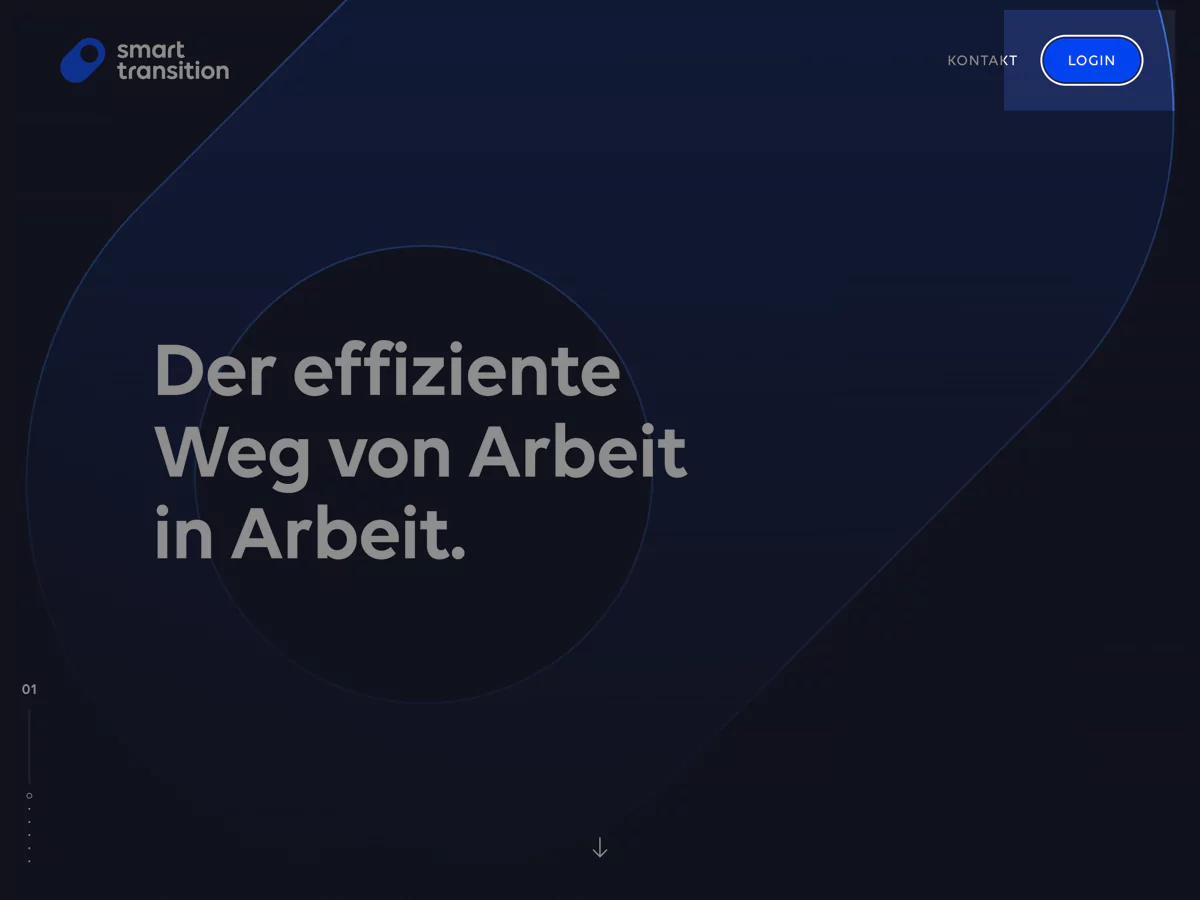
Smart Transition

On the Smart Transition website I made sure to have consistent focus outlines across different elements. The outline color matches the text color and the offset ensures it’s always visible.
Verlage gegen Rechts

On the Verlage gegen Rechts website, we use random colors on every page load. The focus outline always uses the current text color and an offset. This way, the outline always has enough contrast.
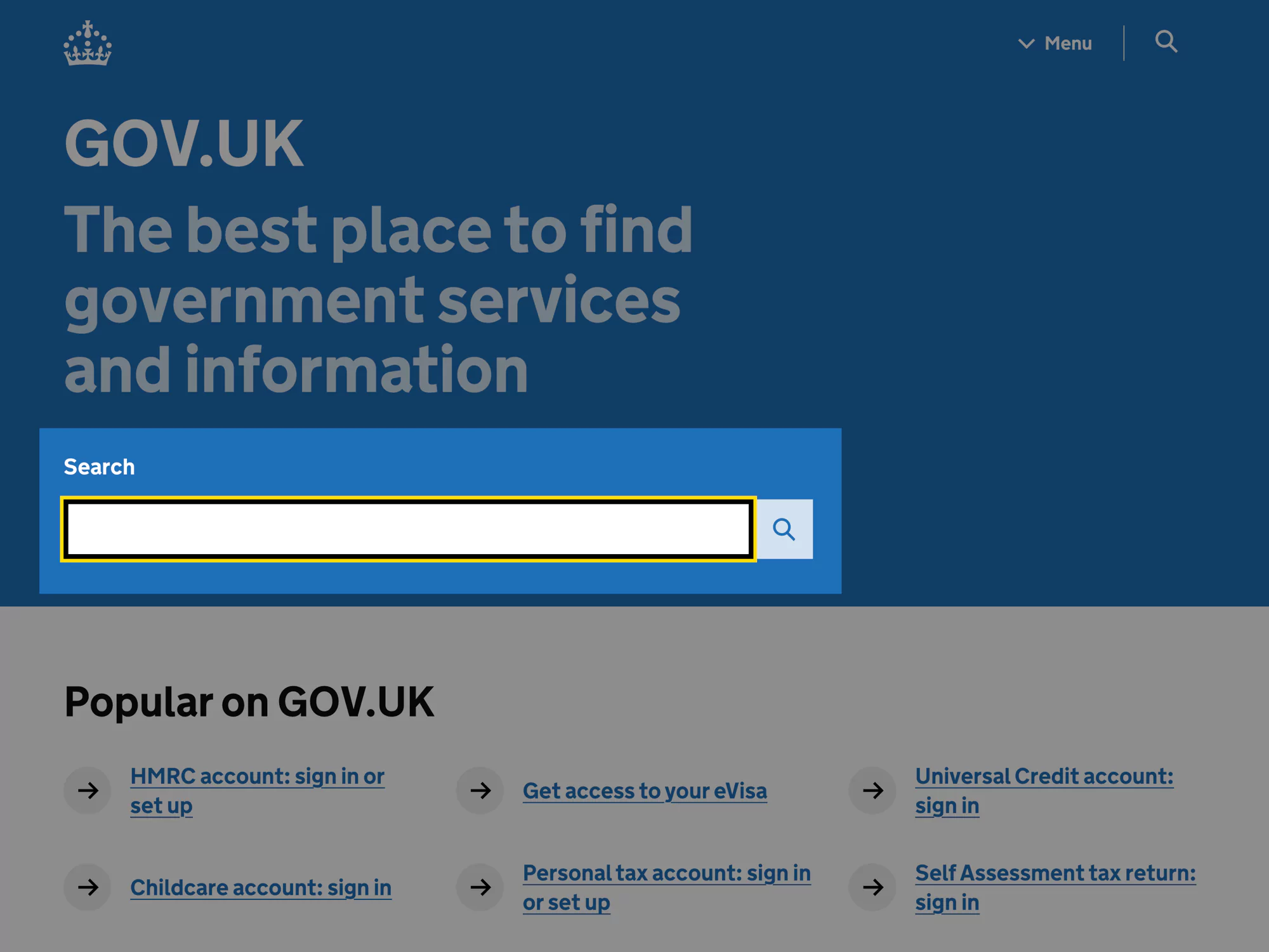
GOV.UK

The UK government website uses a high-contrast black outline with a yellow border. This combination works on any background and looks great in combination with their blue.
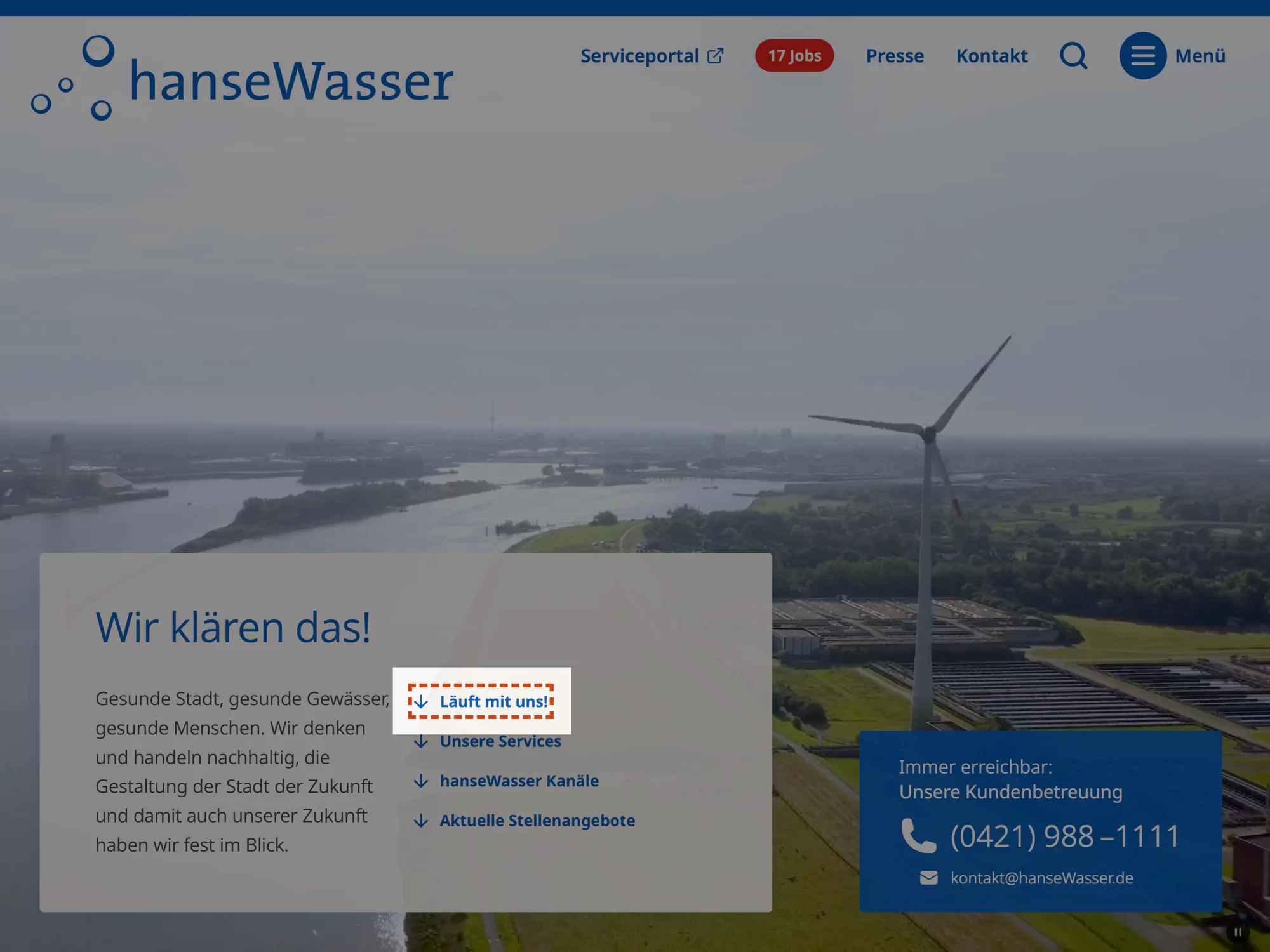
HanseWasser

The HanseWasser website uses a red dotted outline matching their brand colors. They use this color consistently across different elements.
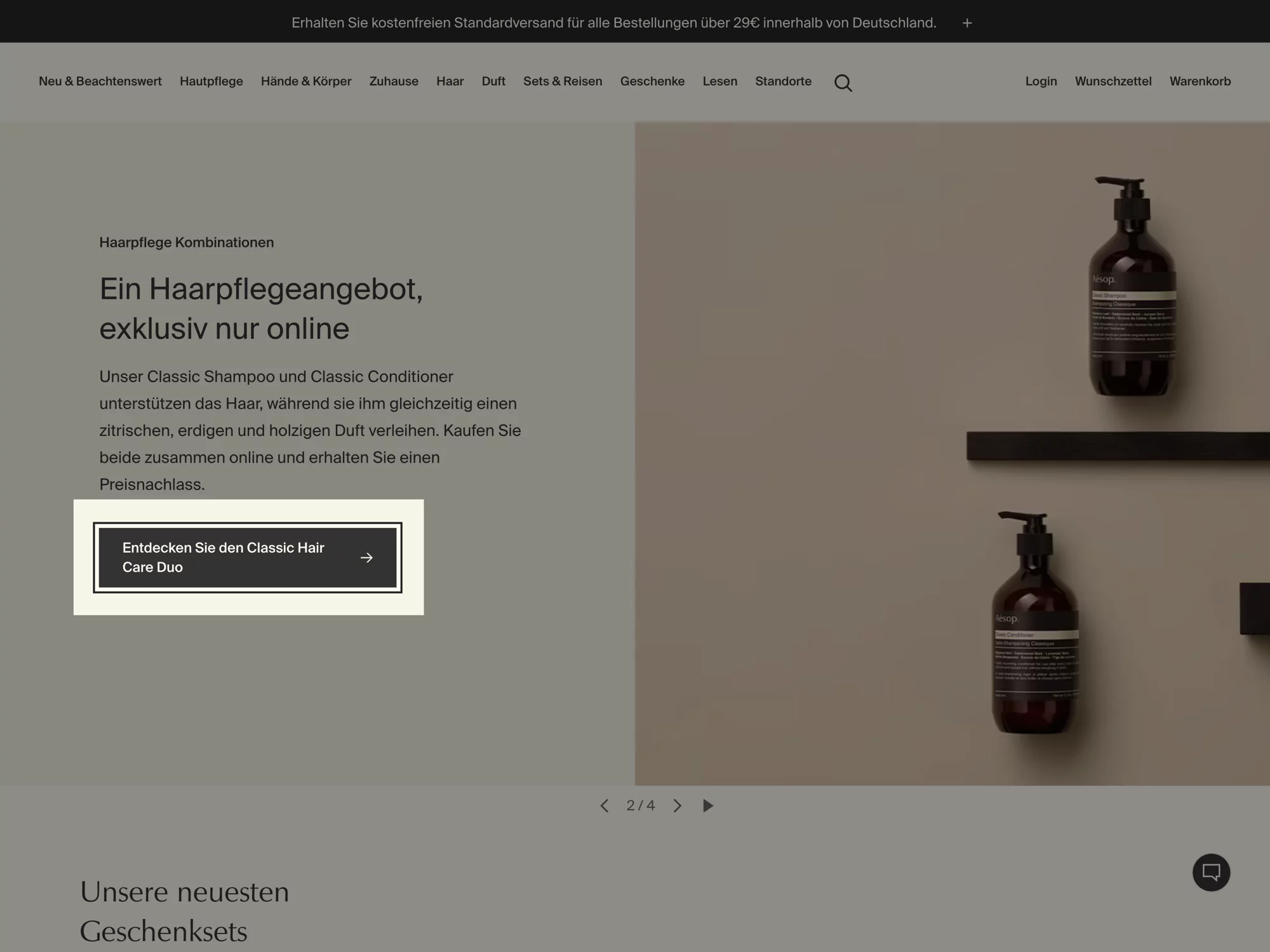
Aesop

Aesop’s website uses a simple black or white outline for focus states, depending on the background colour. This minimalistic approach fits their design language.
DW Learn German

The DW Learn German website uses a blue and green outline for focus states. Interestingly, the focus outlines animate between elements. Not sure if this is a good idea, but it’s definitely special.
Final thoughts
Focus outlines are fundamental to an accessible web – they’re not just a nice-to-have, but a core part of how many people navigate our websites. I hope this article helps you create better focus outlines in your projects by incorporating them into your design process.
If you have your own approach to focus outlines or interesting examples to share, I’d love to hear about them – you can find me on Mastodon.
Replies
-

@Thomas Günther Ha so cool! Just wat i am focussing on for clients a lot now. Great examples!
-

@ankedesign Thank you, that's great! 🙌
I'd love to hear about your experience with clients and designers when it comes to this topic. That might be one of the hardest parts about it. -

@Thomas Günther thanks a lot for this article! Well written, easy to follow and just in time for our next project!
-

@Thomas Günther great article! Love the animations and different background info
