My wife and I recently relaunched DI.DAY, the website of an initiative that celebrates “Digital Independence Day” every first Sunday of the month.
When I heard about their need for an accessibility-focused relaunch, I immediately reached out. If you’ve spent any time talking to me in the last few months, you know this topic is very dear to my heart. In that case there’s even a good chance you’re already a bit annoyed because I simply wouldn’t shut up about it.
It’s quite rare for me to work on websites I’ve previously used myself and that makes it all the more special. Here’s a quick before and after of the home page:
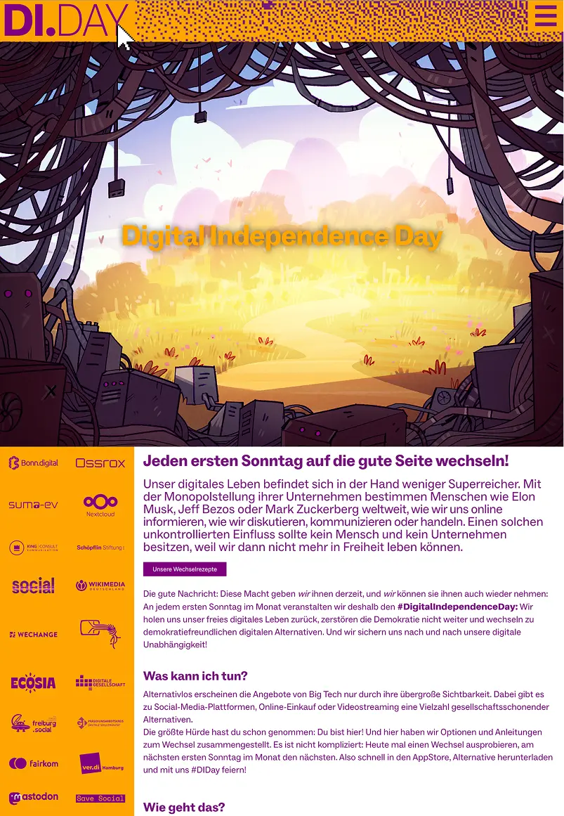
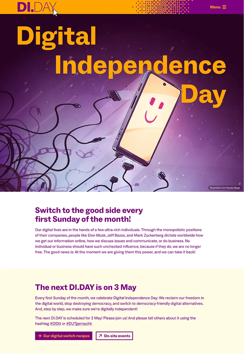
I think Yoshie really delivered in translating the existing design language into something both accessible and aesthetically pleasing (or how kids these days would say, “she cooked”).
If I ever find the time, I want to write a proper case study for this site because not only one, not two, but three new Kirby plugins ❶ were born working on it.
Anyways, in this article I want to share some thoughts on digital independence in general.
Becoming digitally independent
For me personally it all started with Elon Musk buying Twitter and turning it into whatever it is now. Some time later now, I guess I’ll have to thank him for making me and many other people in my web/tech bubble move to Mastodon. My feed is better than ever!
Things like search engines, browsers, payment providers and messaging apps ❷ all have really good alternatives nowadays. For me personally it’s Ecosia, Ungoogled Chromium, Wero and Signal, but there are great alternative alternatives. It’s a no-brainer, really.
Apps like Instagram and TikTok however, I didn’t even want to replace. Reading a lot of books and articles on that matter, I’ve come to the conclusion that I simply can not healthily consume content on these apps. I did need a bit of distance to understand why these algorithms are bad for my health, though.
For the first time on this blog (and in my life) I’ll write a little piece of fiction, trying to convey this necessary distance:
Meanwhile on another planet
Establishing connection…
Initializing translation module…
“But it was engineered to do exactly that!”, cries the surprisingly cliché-looking alien in a room full of other, similar looking, green and slender creatures. They seem to be loudly arguing about something.
“Just imagine”, it continues with a calmer voice, “imagine a planet far away, with, let’s say, humans—”
“What a stupid name!”, the longest and greenest of them exclaims. This comment earns him an angry look by the speaker. “Do you have a better name?” it asks. No answer.
“Imagine they also had companies like Qfb0oih and h0ap.” After mentioning these all too familiar-sounding names, it contemplates whether to invent a fantasy name for them, too. Maybe I’ll just randomly press some keys on this…, it ponders, its arms quickly moving towards a round device.
“Anyways. Everyone has a glowing, round—”
Connection lost. Trying to reconnect…
“—sure, you’re right. Everyone has a glowing, rectangular device they’re staring at”.
Meanwhile some of the listeners look at the glowing, round devices in their hands with bored looks on their long faces.
“They really, really want to look at these things all the time. And it’s not even their fault. Their equivalent to Qfb0oih is making money by showing them other companies’ products and services on these screens. The more humans watch, the more money they get. So they’ve figured out which emotions make them look at the rectangles the longest and built algorithms around this knowledge. And it works. They move around, always looking at rectangles, they even get into accidents, neglect their loved ones, miss important moments like the first time their newborn levitates.”
Connection lost.
That was fun. Maybe I’ll revisit the so far nameless planet ❸ in a future article to talk about other things related to digital independence. It’s certainly not just the algorithms. Enshittification and the centralisation of the web itself are big problems, too. Maybe I’ll find another planet with these issues.
Back on Earth
More recently, the behaviour of Tim Cook around Donald Trump made me slowly move away from Apple. This would be a huge shock to my younger self. Still is to me now, to be honest. It might sound silly to you, but Apple was such a big inspiration for me ever since I started working in this industry. I still remember the first time seeing Mac OS X Tiger on a then high-end Mac Pro. Booooong.
Sure, Apple’s user interfaces haven’t been great for some time now anyways, but I’m still in the process of finding adequate hardware replacements. Phones are easy. My MacBook seems to be harder to replace. Recently I’ve found TUXEDO Computers and Slimbook who are both selling Linux ultrabooks. While I’m not particularly aligned with the company politically, Framework seems to work on a “MacBook Pro for Linux”.
If my MacBook dies next week, I’d go with the TUXEDO InfinityBook Pro 14. While I’ll have to make some compromises in design and build quality, I could even put a 🥨 on the super key for 24,37€. Worth it!
Compromises? Oh no!
One compromise I’m refusing to make is using ugly software. It might sound snobby, and maybe it is, but working on user interfaces every day, I simply can not turn off the fault-detector in my eyes.
Is this aligned? Does this have enough contrast? Are these icon strokes consistent?
Free software is always ugly, right?
To my surprise, this fear, this prejudice of mine, has largely been proven wrong. Free, open-source software doesn’t have to be ugly anymore. Something seems to have changed in a lot of communities and developer teams.
Yes, there are still some (big) examples for something you could call “developer-driven design”, or a lack of design altogether. But it’s changing. A very good example is Audacity, and I’d recommend watching Martin Keary’s video about the incredibe version 4 redesign ❹ .
Let’s hope this trend continues!
Good design
I know very well that good design is not done in a graphics program. It’s done by communicating.
It’s happening in that one moment where your client insists on having 20 menu items on the website because “they’re all equally important”. It’s happening in a pull request for an open-source project where nobody takes design seriously.
I have a lot of respect for the people who inspired this change because it takes a lot of energy to stand your ground in situations like these. On this topic I can also recommend watching Tobias Bernard’s “Report From the Trenches”.
I can also recommend following some design people in the Linux universe. Maybe not surprisingly, but certainly convenient for me, they’re often on Mastodon. Reading their updates and watching their videos gives me the same feeling that Apple keynotes gave me a long time ago. Just more… real? Certainly less fake.
In part 2 of this article, I want to talk about the concrete software alternatives that surprised me the most with how great they are. I’ve already started a list, stay tuned!
- Language Access, Change UUID and Token Field. You can also have a look at the backend on kirbysites.com/di-day ↩
- I’m particularly proud of my mother who switched from WhatsApp to Signal all by herself, following the switch recipe. She continues convincing everyone she knows to do the same and I think that’s amazing. ↩
- Is naming the hardest part of any craft? ↩
- Yes, I’m aware of the irony of linking to YouTube videos. I’m not perfect but “perfect” is not the benchmark we should hold ourself accountable to. ↩
Replies
- 3 replies
- 7 boosts
- 15 favourites
-

@Thomas Günther @yoshie oh, das ist cool! Good work.
-

@Thomas Günther @yoshie Thanks for this, Thomas.
Looking forward to part 2. (No pressure. No pressure at all! 😅) -

@Thomas Günther “I can also recommend following some design people in the Linux universe” Would love to know who some of these people are!
-

@Cykelero There's too many! Looking at my timeline/following I see @cassidy, @tbernard,
@jimmac and @CleoMenezesJr ❤️ -
@Thomas Günther Thank you :)